A new (better, simpler) dashboard

Fred Oliveira on August 11, 2009, Comments (24)

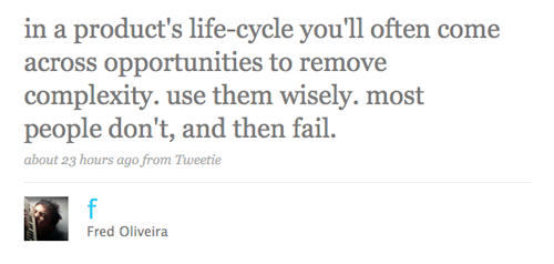
We’re really happy about Goplan. We think it’s a beautiful product, and we’re delighted about the feedback we’ve been getting from you guys - you being happy makes us happier. Still, there was this one screen we weren’t that thrilled about. On top of that, it is one of the most critical pieces of the application - your company dashboard. Yesterday, while thinking about the dashboard problem, I tweeted:
complexity

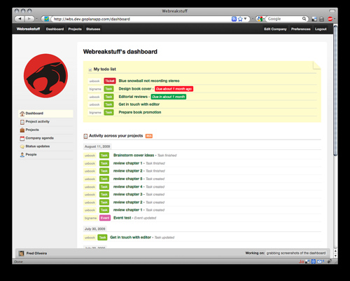
Quite a lot of people believe that making a product better means adding new stuff. While that is sometimes the case, sometimes you can make something better by simplifying (Maeda’s laws of simplicity come to mind immediately - read that book if you haven’t yet). That’s what we’re doing with the dashboard redesign. The new dashboard will have less stuff than the current one does, and the thinking behind that move is quite simple. A screenshot first:

Goplan 2 - Streamlined dashboard

There are two main things you need from your dashboard on Goplan. You need to know what’s going on in your company - which is what the activity feed is -, and you need to know what you need to do - which is what the todolist bit is. The old project and people lists are gone. How often do you need to use those? Companies don’t add new projects or people every day, so they’re basically just UI pollution. Off they go.

A penny for your thoughts?

We’re still not done with the dashboard redesign. We’re constantly thinking about it, and before we launch the update, there will likely be more changes to both its design and functionality. But we do want your opinion. What do *you* need off of your Goplan dashboard? If you have any comments, feel free to send them in, either by commenting on this post, or sending us an email at our support address. Thanks!

(PS: we’re aiming to launch the dashboard update by early next week)
Comments:

I quite like it. Very clean and focused, great use of white space and color.

The only problem I foresee is in the case of a lot of items in the Todo List. If it grows very large, it pushes the activity feed to the bottom. As the Todo List may often change less than the Activity feed, I’m not sure if it’s the best option.

Have you tried with a two-column layout? Maybe it becomes too tight, but I would try if I were you guys.

Otherwise, keep up the great work!

We were using a two column layout before and that was one of the big reasons for the layout clutter. I do understand the concern with the vertically-large todo list, but that might actually be an incentive for productivity. But we will keep your thoughts in mind while we iterate over this design during the next few days.

Thanks!

Hey Guys, sounds good.

Just be sure to avoid going down the line of your major competitors by keeping things so excessively “simple” that there aren’t any exciting features left.

Neat. The current one i a bit pokey and empty for my liking, especially on a widescreen laptop and monitor. As a freelancer the activity bit is less important to me, but an instant to-do homepage area is a good idea. I’d welcome moving projects further up the list on the left hand side too.

In and ideal world i’d like to start using this site as a hub for what I do day to day, so the more I can centralise my workflow around it, with everything just a click or two away, the better; for example, having a front page calendar that synched with my iCal would be nice!!

Beyond basic landing page design, a few things that I think are very important..

1) Limiting client’s access (“collaborator”) so that they can’t delete items the admin creates. This seems huge.
2) Basecamp has a nice notification service for discussion threads for all involved. It’s as simple as a “should ‘xyz’ be notified..” - Right now, I don’t know when people are adding discussions on the fly.

Good stuff so far - I can’t wait for the improvements!

Actually you can send notifications to specific people by adding one or several @alias (eg.: @john @rachel @kim) in the item’s description.

If the cited people have the set their preference to receive notifications of “Important” items, they will receive the notification. :)

@Sócrates - That seems too convoluted for the typical client. It should be simple and straight-forward (speaking of keeping it basic).

Absolutely perfect. Everything I need. Currently there’s so much information of the same color/texture that I never know what to focus on. Well done.

Looks nice. Probably a little tricky to implement, but it would be great to be able to push (bump!) to do items to the top of your dashboard to do list if they’re things you want to work on on that day. As this list is things only YOU need to do, it makes sense to personalise it a little.

I use GoPlan a lot but still find myself writing out by hand a “things for today” priority list! This idea might also be handy for people with long to do lists or lots of projects (considering it is sorted by company now - and I guess due date, but a lot of my tasks don’t have one).

So I’d like to be able to further clarify my “next actions” :-)

James - that is excellent feedback. I too find myself using post-its for things I find on my Goplan todo list. We’ll definitely think of more ways to make the personal todo-list a more effective tool. That is definitely one way. Thanks for your comment!

Hi there!

I’m not the best person to talk about this, but I think that limiting the to-do list (by…10/15 items?…and then have a link to pull the entire list) is the best way, at least for me.
I don’t like to see to many things, I always get lost in the list..

But this is just me.. I don’t know if you agree with me :-)

This doesn’t actually fit under this subject, but how about making it possible to move tasks between categories? This way I don’t have to enter tasks again when I get done with something and want somebody else to take a look at the same thing from a different aspect. I.e. I take care of the design of something, then I want to move it to a backlog category, but can’t.

@Oliver: you can move tasks to other categories within a project. Instead of closing a task, edit it and change the category from the dropdown. You can then reassign it to the person that needs to work on it next.

Back to this topic, it seems we are really discussing the fact that go plan really needs to aid both project management with teams (like the points Chris made) and personal workflow/productivity (things James and myself have highlighted). Look forward to seeing how it develops.

Об интересных вещах пишите. :)

I think this is a great and focused UI. But now you have a gaping hole that was once filled by the projects and people lists. Maybe move the todo list over there?

Ever thought about adopting an approach like personalized homepages (iGoogle,Netvibes,Pageflakes)? Basically you define the “sets of information” (e.g. Todo List) that can be shown in the dashboard and the user will then decide which ones he wants to see there.

A to-do list across projects is a great idea - but I would miss the project list - it’s not so much for opening a new project (but that’s good to have handy) but it’s good for reviews to have a list of projects easily accessible. Maybe it’s irrational but I like seeing them listed there rather than having to click on the projects drown down.

We all have different tastes and needs so I think the best solution to let users customise their dashboards for what works best for them.

Sorry, meant to say that the to-do list across projects at the top of the page is a great idea rather than where it is now at the side.

Our dashboard just changed from the two column layout to the one column from above. To be honest we like the two column better. Left the company activity and on the right my tasks. Now with just tasks on top and activties underneath its hard to keep track of stuff that got added, a discussion for example or a document got uploaded. And with common screen resolutions the one column running really wide and wasting space in my opinion.

but as always. many people, many opinions. :)

[...] couple of hours ago we pushed the new dashboard to the live servers, so if you haven’t seen it yet, login to your company space and have a [...]

I think is better 2 columns… One for Project Activity and other for personal tasks…

;)

I’m new to GoPlan and am liking what I see so far. Is there a means of admin users viewing other users To Do lists on the dashboard? For example, managers viewing team member progress across all projects.

Just wanted to say hello all. This is my first post.

I hope to learn a lot here.

Hello , i am a3d_a4xtdf, im having some serious issues with my mx 560 graphics card

Sorry, the comment form is closed at this time.